Here is an example of a traditional camelback:

A bold take--I love the fuchsia color! Such a surprising choice paired with a classic brocade.
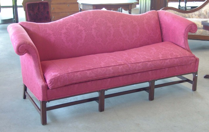
Even Oprah is with me on this! I was googling around for other pictures and found her post on "Perfect Sofa".

Mine looks like the one in the middle. When the Ethan Allen decorator brought the swatches to our house and compared it to the carpet/wall color/baseboard, we both thought it'd be a very light ivory-just a shade more pigmented then our creamy white window trim. I knew that large swatches of fabric look more intense because we made that mistake with our new carpeting. The little carpet square looked light but after it was put it, it looked much darker as a whole. I have been mistakingly referring to our sofa as "white" when it's actually a rich creamy ivory. Memo to future sofa buyers- although our mistake was serendipitous (we love how the ivory warms up the room), keep in mind that colors look more intense when used in large proportions!
No comments:
Post a Comment